New film reviews are all spoiler free!
Oldies are a little more in depth!
If you want to suggest a film for me to review tweet or Facebook us!
Showing posts with label Reveals. Show all posts

Monday, 12 January 2015

Thundergun Express by Eat Defeat AND RobinBookerFilms

Hey guys, still getting through last years footage but from the depths of my edit here is a video I shot on tour in Europe!
So a little talk about my process and a small deconstruction of the video if your interested...

Last time for Eat Defeat I just used the show footage however this time we wanted to show some of the antics of the trip itself. So I spent around 3 days watching 450gb of footage and cutting out a few seconds per clip of funny stuff. There was a lot more good content however a lot of it lost its kick when you cant couple it with audio.

I ended up with about 5 minutes of footage to make a 3 minute song. I looked through all the performances and cherry picked my favorite moments to add into the shenanigans from the rest of the trip. Music videos are quite fun to edit because you have not only a beat to work to but specific sections. I added a little more performance footage to give the choruses more kick.

I used the large amount of dancing for the other parts of the choruses and then the wrestling for the middle eight. The rest of the footage was just the best of the highlights and the best time fitting shots. Finally I tweaked all the shots in length and a few in speed so that they matched the beats a little better.

Tuesday, 21 October 2014

Production!: 2 Projects in post, 2 Projects in Pre

I have spent the last month or two shooting almost a 1tb of footage! All documentary type stuff. Firstly I worked with Kismet (a local drama company) and the RSPB to film their Marsh Songs dramatic production. I am in the middle stages of editing a short promo of it for the RSPB, a full performance dvd and a short documentary about the drama production. Hopefully to be completed within the next fortnight! Lots to do.

As if that wasn't enough I decided it would be fun to go around Europe with my brothers band Eat Defeat and film all of their shows and a lot of their journey. Lots of fun but very tiring work, I haven't even begun to edit yet, but theres no deadline so at least theres no hurry.

I am finally working towards directing my first short in years, since outbreak file2! Sin (working title) is a sneak peak into the universe of my science fiction pilot Return to Earth. Set on a post apocolyptic world inhabited by rebels, scientific experiments and "utopian" cities I cant wait to actually start filming next month. Its going to be a tricky job to set the scene right but I'm up for the challenge.

And the fourth and final project is so early in pre production that at the moment its just a few brain storms on paper. So I'm not going to tell you what it is just yet other than hopefully it will be a web series co written with Ari Carr!

So thats what I have been up to, I would go more in depth but I have to get back to it...

Sunday, 14 September 2014

MarshSongs


Marshsongs is a community led RSPB funded project including the prestigious Kismet drama group and countless creative members of the community. The aim of the production, as well as to entertain of course, is to raise interest in the recently renewed Beckingham Marshes Nature Reserve. What does this have to do with me? Well roughly a month ago I was contacted by the group to do some film work for them, principally to edit some wildlife footage for projection throughout the play. This grew into a short doc type film as well, chronicling the practice and progression of the project.

It has been great fun and practice so far, with just one week left before the performance everything seems to be falling into place. The script, written by Michael Hatfield, is being wonderfully performed in rehearsals and the music written by Russell Booker is being played by a select for students from The Gainsborough Academy fits the performance perfectly. The play, based around the Beckingham Marshes themselves, jumps through time to describe how humanity treats such land, its comical, dramatic and, through the personification of the Marshes, surprisingly dark. KISMET's physical style and the live music really bring the play to life, I am looking forward to seeing the live performances with the added energy from the audience.


The show is on next weekend in Beckingham and the following weekend at the old hall get tickets here: Telephone 07756 500292. Five pounds full, three pounds concession

Really do it, it should be a great show. 


I am hoping to have enough footage and story to do a slightly longer documentary, maybe around 10mins so keep your eyes out for that too!


Monday, 12 August 2013

Lighting Changes in Film and Witness

Whilst it was very difficult to find theoretical texts about lighting changes some of the basics are obvious. Although often driven by narrative events lighting changes signify a move into a more internal diegetic state, a point of view, a subjective shot. We took this meaning and applied it to the lighting change in our own film.

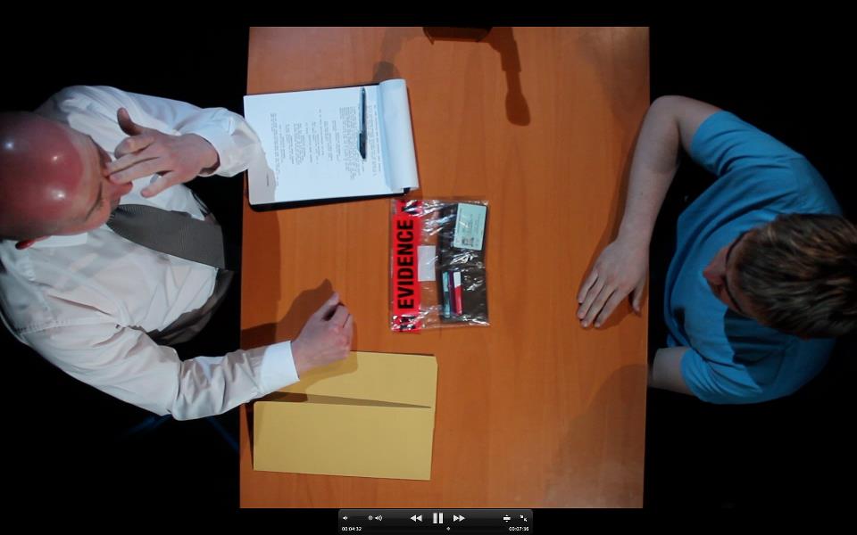
At pivotal point in the interrogation scene the detective slams an evidence bag on the table containing Brad's wallet. We go into brads mind, we see the pressure build on him represented by the harsh blue toplight on both him and the evidence bag. This was my shot to set up and I achieved the effect by lighting Brad with the top lights and then naturally washing out those specific effects with more naturalistic lighting around the scene.

I think the effect works really well, it really emphasises the pressure on Brad and emphasise that he knows its his wallet and that he is in trouble. We tried the scene without the lighting on Brad changing, just with a spot tightening on the wallet but the change wasn't drastic enough.

I think we have achieved an effective lighting change, although it isnt narratively explainable I think it is justifiable as a subjective insight into Brad's mind. We will have to cut to a reverse shot to take the audience back out of the internal diegetic shot but it should work nicely.


Sunday, 11 August 2013

Colour in Film and Witness

Colour is a massive part of cinema, its one of the key aspects of mise en scene which define the mood, themes and even tell the narrative of films. We have approached colour in various ways in our film to both create coherence and to symbolise poetic and subtle meaning.

In Syntactic Role of Colour in Film by Ornam Rotem the basics of colour in terms of film and "world building" are laid out. He first talks about the "three dimensions" of colour "varying hues, as degrees of intensity or saturation and as levels of brightness." When discussing this the the Munsell colour system comes to mind as a simple visual representation. Rotem's article goes into depth about how a colour grade can create a world; "colour, in all its dimensions, plays a crucial role in being able to give a film a sense of whole". It is clear in films that often a certain tint can be added to alter the feel. Rotem talks about using the "real world" as a reference point however he more interestingly identifies the struggles with defining real, a different philosophical debate all together. In The Matrix  two clear colour tints are used as "key unifying element(s)" for the  real world and the Matrix. In the following images the green tint is obvious, all of the blacks are incredibly green, this represents the green letters on monitors and the green computer program that is the Matrix. Subtle to the average viewer the hue of the tint is one of the unifying elements of the Matrix, when taken out of it and placed in the real world the image is quite different.
In the real world a colder more metallic aesthetic is apparent, a blue is  added to the majority of the grimy looking shots. The machine aesthetic is clear however it is no longer green and artificial but real cold and blue.
Whilst neither of the worlds are the real world we see, this comparison validates the ability to compare filmic worlds and colour with real life. Most films stick to one or two tints, as Pans Labyrinth (2003 del Toro) does contrasting itself, showing two separate worlds, thematics or points of view within the film.


Another option with the overall colour wash is to subtley alter it throughout the film implying a characteristic change. This technique is brilliantly used in Mark Romanek's One Hour Photo (2002 Romanek) in which an antiseptic white becomes dulled and beige showing the characters clarity of mind despite the twisted view he has on the world. It also at times represents the fantasy in his mind and shows the settings from the view points of different characters, all elements achieved by subtle manipulation of the colour in the mise en scene.


Children of Men (2006 Cauron) uses its unifying colour scheme to represent a clear mundane and not too distant reality. All of the camera work and writing aims at realism as does the colour, a grim realism but realism none the less. However as Rotem says what is real? How do different people perceive colour? or reality? All questions on a philosophical level that question how real a films colour wash can ever be and what it can achieve.


All of the aforementioned colour schemes are clearly not all encompassing but jus some of the wash manipulations used to convey meaning and emotion and tie worlds together coherently. Rotem says that "Worlds evolve, transform and change. However we choose to talk of worlds, there seems to be no possibility of ignoring the need to recognize their marks of coherence, their internal signifiers that serve to agglutinate their disparate elements" this sums up the way "worlds" interact with colour in film and hints at the smaller, the more specific, minute objects that stand out because of colour, not world colour but specific item colour which adds completely different meaning.

When lighting our most controlled scene, the interview, we used blue gels to make the scene look as cold as possible without looking unreal. This added a harshness cold and darkness to the scene that we really loved, the light looked more like dark falloff light than actual directed light which was the intension. The coldness is the most important thing, a slightly antiseptic feel, and a really dark horrible looking room to be in.

After taking this shot we looked back at the other footage and some of it was a little washed out, we tried warming it up in the edit but decided that to build a coherent world we would make the scene a little colder with three way colour correct. This makes the whole film much more coherent and carries the cold harsh feel throughout the whole thing.


The other just as subtle use of colour is to symbolically link an item or character to an emotion. When we see colour we immediately attach meaning that is derived from what the colour connotes to you as a viewer. Some believe, like Rotem "that colours have no universal meanings and that their semantics are determined by their social and historical import". Whilst this is true it can no be disputed that in the correct environment a colour can connote something to the majority of its intended audience and therefore be used as a code to attach significant meanings to items. Context however is also important in this situation, red lips for example connote beauty however the red on a stop sign connotes danger. This simply shows that colour is part of the language film uses to suggest hidden meanings, when multiple things in the form connote the same meaning a coherent message can be read into the film.

For specific use of colour to convey subtext Brads babyish blue shows his innocence. The detective has a black and white motif showing his authority and strictness that becomes infected by the yellow folder, the point of deception and lies that corrupts his mind. The folder leads to the red evidence label clearly shows the danger to Brad.


Websites
1. Syntactic Role of Colour Rotem O., DATE!, Last Accessed 1/5/13, URL http://www.kinema.uwaterloo.ca/article.php?id=131&feature

Filmography
The Matrix (1999) Wachowski A. Wachowski L., USA, Warner Bros. 
Pans Labyrinth (2006) Del Toro G., Spain Mexico USA, Estudios Picasso
One Hour Photo (2002), Romanek M., USA ,Fox Searchlight Pictures
Children of Men (2006), Cuarón A., USA, UK, Universal Pictures, Strike Entertainment, Hit & Run Productions

Saturday, 10 August 2013

Long Takes in Film

One of the most influential and important things about long takes is the natural sense of realism they portray. This is the element of long take which we wanted to pirtray. All the way back to Andre Bazin and the Neorealism he defined long takes have been regarded as realistic however they are still varied.

One simple often used kind of long take is an extreme long static shot. This keeps all of the action in the shot and ensures that the audience know whats going on.  A strong believer in the long take is Micheal Haneke, in his film Hidden (2005 Haneke) Haneke creates a film narrative with his long takes playing with the audiences beliefs as the audience watch a tape of a long shot being watched by characters. The level of realism the shot portrays transcends two levels through the film with the objective of unnerving the audience with its realism. The "look" defined by Mulvey in her "Visual pleasure and Narrative Cinema" clearly applies hear, the voyeurism portrayed in the film is what gives it its edge and the effect is created in large by the extremely long takes.

The film Children of Men (2006 Cuarón) uses similar long static takes but also uses dynamic choreography to stage long takes that follow action up to 6 minutes at a time through streets and building. Again the aim is realism however the footage has a more documentary feel, for our film the locked off shot seems more appropriate.


Filmography
1. Hidden (2005), Haneke M., France Austria, Germany, USA, Les Films du Losange, Wega Film, Bavaria Film

2. Children of Men (2006), Cuarón A., USA, UK, Universal Pictures, Strike Entertainment, Hit & Run Productions

Bibliography
"Visual pleasure and narrative cinema." Feminisms: An Anthology of Literary Theory and Criticism Mulvey L., (1997): 438-48.

Friday, 9 August 2013

Point of View in Witness

Point of view is used for lots of things in film and many important texts have been written about it. Principally Mulvey's Visual Pleasure and Narrative Cinema (Mulvey 1997) in which she establishes the terminology of the "gaze", and specifically the "male gaze" which dominates hollywood cinema. A common thing to do, especially in student films, is to use the POV to show a problem with vision, either a drunk state or passing out is common, it doesnt fit with our film and often looks cheap we wanted to use an effective but more subtle POV.

Another term often used within film when considering POV's is an eyeline match, a shot before the POV in which a head or eye movement signals the motion of the camera in the next. We sort of do this, our POV comes from a dead man, whilst we cant show moving eyes or head we use a shot from behind the shoulder with a fish eye lense to esablish the sense of space and then go to the POV a few shots later.

This helps the viewer realise they are looking through the dead bodies eyes. Our opening shot is also technically from the same point of view, the effect it should have is to make the detectives and forensic staff look towering, almost intimidating and to take away from the identity of the dead body, its just another case.


1. "Visual pleasure and narrative cinema." Feminisms: An Anthology of Literary Theory and Criticism Mulvey L., (1997): 438-48.

Thursday, 8 August 2013

Witness

Its still rough unfortunately... the edit and the sound quality aren't great but I think you guys should see what it looks like before I start deconstructing it so here it is
http://www.youtube.com/watch?v=BaWsauJ1Ymk

Witness Shooting Day 3

Today was finally mine and Georges shoot, in the workstation, with lots of lighting work to do it was a very different shoot to the others. We moved a few walls in the Workstation, and I understood how the set works out after doing CPR last year, and got the set as ready as we could before the actors arrived. The biggest problem of the shoot was 3 bad marrantz's that took about an hour in total off our shoot. Being worried about time Connor wanted us to get a 2 camera setup and run the whole scene for coverages sake. I got on one camera and George got on the other and we lit some brilliant shots. We used blue filters on all of the lights to give it a cold aesthetic.We were framed a little differently  my shot was quite a bit closer than Georges so we got a second similar setup with my camera wider and Georges closer. For this shot I lit Brad with an intense but cold light when he sat forward and when he leaned back he had a strong backlight outlining the right side of his face. The detective we lit only when he sat forward so that when he leant back there was only "fall off" light on his face giving his character the dark, slightly sinister look we wanted.

This again ate up a lot of time and we considered shooting the scene in order but with the lighting change being in this scene we decided it was the most important shot to get next. George and Connor had an idea for the shot in which the top light spots down to highlight the evidence bag containing the wallet. I personally didn't like the shot and the fact that I hadnt been able to get my shots in was frustrating. With the amount of people moving about on set and the shot not being one of mine I let George get on with it.

We then moved on to one of Steve's ideas that George also had storyboarded, a birds-eye shot of the interrogation. It was a brilliant idea but the execution was very difficult  What we decided to use was a C Stand and clamp holding the handle of the tripod (with the legs detached). It was a little precarious and the camera is heavy so whilst the scene played out we had someone close, steadying the camera. Although an unusual shot I think it fits the aesthetic and will cut brilliantly in between the close ups.

Time was getting short, this was the one off schedule shoot and we had to start deciding what not to shoot, as we had a close and med of both characters I let my two tracking shots go and we decided to get another lighting change as it wasn't just me that was unsure of the previous one. My personal idea for a lighting change was to set up the spots on Brad and top light him so that he looked really dark intense and panicked. Then we flooded the rest of the scene to make it more natural so that once the wallet is dropped on the table we drop it down to the spots to enhance his reaction. We also kept the spot on the wallet in a similar way to the lighting change before and it worked really well, I was extremely happy with the reasult.

Finally we got a basic two shot, with similar lighting and ended the day with enough coverage and some exciting shots.

Wednesday, 7 August 2013

Witness Shooting Day 2

Despite being the hardest shoot of the week, on schedule, today went really well, again we were really tight and worked like a well oiled machine. Mainly Mark's shoot we again all got a look behind camera and had little inputs and in fact got in front of camera as extra crime scene officers. Much as the day before I dressed the blood and not much more can be said. The weather was brilliant and the actors were great and it was one of the smoothest shoots I have been on. Sound was a little bit of a problem because of bad equipment and bad wind but it worked out ok in the end.

Tuesday, 6 August 2013

Witness, Shooting Day 1

After being set back a little by actor problems we decided they were worth the wait and that we were a tight enough crew to get it all done in short time. So we set for shooting monday, tuesday and thursday.  So today's shoot focused on Connor's sections, the flashbacks. The shots are to be cut between the interview material, when the detective suggests a turn of events or when Brad tells a turn of events these are the visuals we will see. Whilst we may alter their colour in post as in television programmes such as CSI and Cold Case the core visuals are still important. We didn't need sound which made things much easier and with strong scheduling and storyboarding with Connor it all went smoothly. As a group we all got a look at camera and made little suggestions to make the shots stronger and stronger. I am really happy with the aesthetic and with the rate of turn around of shots, I am confident we will shoot everything on schedule due to us working as a strong team.

I basically acted as runner for the day whilst looking at shots and working with the rest of the team. My main job was to sort out the blood, my own recipe of strawberry treat sauce and red and black food colouring. Unfortunately we didn't plan the drug dealer's costume, or more specifically we didn't own the drug dealer's costume so we couldn't get blood on it. Instead I painted the floor with the blood as close to the actor without ruining his clothes and hoped for the best. The blood looks real in real life but as it was reflecting the sky came out a little purple on camera which was a shame but still looked realistic enough.

Monday, 5 August 2013

Use of Colour in Pans Labyrinth (del Toro 2006)

del Toro's dark fairytale masterpiece set in the Spanish civil war, uses a range of washes and contrasting colours to paint a visual picture and bring the magical to life within the brutal shadow of Captain Videl's tyranny. Colour is one of the most important tools in del Toro's artillery and he uses it in many ways to support the narrative throughout the tale.

As the tale begins, the blue fairytale is told, of a magical princess and her fall from her world. This, the first of many blue washed images reflecting a "well lit night" and the dark side of the fairytale, introduces the visual blue motif connected simply to sad events often coupled with pathetic fallacy. As we see later on this is not the image of the fairytale kingdom itself but the sadness decay and despair since the loss of the princess.


From this we jump back into reality and the setting for the film, the forests around a military encampment, more of a country house manor than a camp, and beautifully full of golden browns and greens. The pervading nature reflected by the vibrant colour pallet setting the scene is essential to the film in which nature is the source of the fairytale, the fairy from the insect, the faun as the mountain and almost nature itself. Without the gorgeous browns we wouldn't believe del Toro's story because we wouldn't believe in the magical quality of nature. The browns are complimented by a general sepia wash that cloaks even the duller shots as beautifully golden hint.


The black cars cut through the nature, sleek and artificial, as do the hands, hat and glasses of Captain Videl as he un-gloves himself surrounded by grey uniforms that represent the dullness of war and army and the conformity demanded by the warped communist government Videl fights for.


The strong pervading blue of night is only pierced by the bright vibrant reds of blood, this contrast adds to the brutality of Videl and the darkness of the fairytale narrative.


The next strong visuals we are given come at one of the most visually "magical" moments in the film, as ink dances across the page and tells Ophelia our fairytale princess what her task is. The sun through the windows, or lights representing the sun, shine a vibrant, beautiful and magical gold that represent the good in the fairytale that returns at the end of the film.


Dressed in her green dress, the princess of nature, Ophelia goes back into the woods and into the toffee brown interior of a dead tree to poison a toad. Again the pervading sense of nature is clear, and whilst the toad is certainly disgusting Ophelia is never in danger whilst she is in her "own realm" surrounded by nature.


She is however snapped back into reality and danger, the pathetic fallacy and heavy blue tint returns and the battle between the rebels and Videl and the battle between Ophelia and an unbeknownst Videl continues.


It is also worth noting, outside of the fairytale, in the war narrative, the rebels hide in the woods and live in caves, they wear brown and are one with nature. Not only are they politically and morally heroic but they are also one with nature as is our heroine.


In the second task and before, the colour red becomes more prevalent and hints at a growing darkness. Firstly the previously golden enchanted book shows Ophelia's mothers bleeding womb  a short piece of foreshadowing as moment later Ophelia's mother calls to her, covered in blood. At this point all tuns for the worst, it is the midpoint of the narrative in which the rebels are trampled, Ophelia's mother turns ill and her fairytale dreams seem to turn evil.


This is reflected when she goes on the fauns next task, into another realm this time, unprotected by nature and surrounded by red walls, food and grotesque images of babies being eaten. It could be said the food represents the harvesting of nature further representing the apparent danger Ophelia is and explaining the faun's reactions to her eating the food as her betraying him and nature. The pervading red colouring in the scene clearly shows the danger and evil of the other realm Ophelia inhabits.


One of the nicest bits of cinematography is one of the simplest shots, the doctors death, brutal, blue, pathetic fallacy. A common visual theme but this is one of the most beautiful executions of the blue shot and the death of the kind doctor stings the audience.


Orange flames light the final scene, a glint of hope for the rebels and Ophilia however it is not enough, the end seems dark, the blue pervades and Videl shoots Ophelia and dark red blood flows from her lifeless body. As all seems dark a golden light pervades and we are transported into a golden realm of the fairytale and we finish with beauty and happiness.


1. Pans Labyrinth (2006) Del Toro G., Spain Mexico USA, Estudios Picasso

Sunday, 4 August 2013

Analysis of Long Takes in Children of Men (2006 Alfonso Cuarón)

Alfonso Cuarón's Children of Men is a masterpiece in terms of both cinematography and long takes. Crafted in all ways around the wish for a documentary feeling, the long takes achieve that aesthetic as does the bland and dilapidated cinematography. Described by Cuarón as a kind of anti Blade Runner (1982 Ridley Scott) the futuristic aspects of the scenery have been allowed to decay and rot to add the sense of realism and grittiness celebrated in British cinema and seen in real life. 

When the film opens it sets the scene brilliantly, a future, decayed, with iconography easily recognisable but noticeably different technology. With London grey and grim no colour pervades, its ugly but real. The take is the first of many long ones following Theo out of a shop before an explosion in the background sets the tone fore the brutal destruction ahead. The president is set and the realism of the special effects, coming from where Theo just was, makes the audience feel like they just escaped the explosion along with Theo.

The lack of colour and lack of nature continues until the introduction of Jasper, Theo's salvation, the person with which he confides and can share his emotion. Jasper's relation to nature, gold and the colour green in general is clear and represents a bright change and a positive peaceful location.

The other point in the film in which art and nature unusually pervade is in the museum of arts that Theo visits. This time the colour represents the power held by the people inside the museum.
The emotion in the film often comes in the scenes steeped in nature and green, again we see an example of this after Julienne dies, our first real outburst of emotion, shrouded by green forests.


At the first fish checkpoint as Theo becomes a rebel, or at least becomes the surrogate father figure for Kee, an important change of clothes symbolises his move away from London and general aristocracy, out of his "suit" and into a new role, situation and mental state.
 Wonderfully set in a barn the cows and harvesting gear represent the production line mentality of not just farmers but society. Mixed in with the cows Kee is in danger of the same harvesting however she is not naive enough to believe she will be treated in any other way. Whilst Theo isnt as pessimistic he decides that standing by Kee's side is what is most important. Kee's clothing also represents her heritage, the sandy orange colour of her dress which flows just enough to show her bump works both narratively and symbolically. It is important to establish her heritage as racism and refugees are some of the strongest themes within the film.

After changing into "fish clothing" he immediately changes again when he is in control, not back to his suit though, to a more gentle navy blue top. This again represents the fatherly image developed as he becomes more and more of a father figure to Kee and possibly her child.

The film continues to get bleaker and bleaker, the Bexton Hill refugee camp realistically represents slums and shanty towns like that of Mexico with a bluer colder aesthetic to match the colder London climate.

Throughout the film the Long takes are extraordinary and fall into many types, one which stands out as much simpler is a gentle track forward on Theo. The stiller and simpler shot makeup gives the audience a chance to just watch Clive Owen's performance as Jasper tells Kee about Theo's dead son.

Alternatively one of the longest tracks of the film, towards the end of the film, in the Bexton Hill location, this jumps all over the scene, dancing around Theo through the street, through a wartorn battle and into a block of flats under siege. Lasting 6 minutes and covering a massive distance the shot almost continuously follows Theo in the hight of the documentary esque coverage of the film. Cuarón says in one of the special features that he wanted it to seem like you weren't watching a film as much as you are following the characters around in 2047 with a dv camera, this take is the perfect example of that. Theo is always well framed and the choreography of the shot is brilliant, it imbues an extreme sense of realism. 

One of the few unrealistically lit shots in the film is the following, the lighting is still believable however the goal of the lighting and sound is to add an angelic sense of miracle to the moment. This miracle stops all fighting around them as the baby stuns soldiers and rebels alike. The lighting audio and acting convinces the audience of the magnitude of the miracle and the importance of the baby.

Right towards the end of the film as Kee and Theo finally escape Bexhill two narrative lighting changes show that Kee and Theo are "out of the dark" safe again. Although still bleak and dim they are out of danger and the baby does have a chance.


The documentary feel of Children of Men is undeniable, the use of subtle lighting and symbolic colour in the mise en scene come together to fill the film with meaning beyond the political and dramatic narrative. Not only is the film well lit and coloured but realistically lit and coloured which, with the long takes, give the sense of realism that is the success of the film.


1. Children of Men (2006), Cuarón A., USA, UK, Universal Pictures, Strike Entertainment, Hit & Run Productions

2. Blade Runner (1982), Scott R., USA, Ladd Company, The, Shaw Brothers, Warner Bros