New film reviews are all spoiler free!
Oldies are a little more in depth!
If you want to suggest a film for me to review tweet or Facebook us!

Thursday, 28 February 2013

CBT! Uncanny X Men 2, Uncanny X Force 2, Young Avengers 2, Guardians... 0.1, Uncanny Avengers 4

Uncanny X Men #2
Uncanny X Men 2 hit the shelves this week, only a few weeks after the first issue, and it offered a similar pace, plot and poor level of art. Unfortunately I am not a fan of Chris Bachalo's work so for me this titles art is disappointing and painfully similar to his previous xmen work, everyone must wear goggles and be out of proportion. However I understand that a lot of people like him so im going to have to look past that and to the rest of the comic. It began promisingly with an emotional heart to heart between Emma and Scott, defining their current relationship, it was a really nice quiet moment amidst the insanity that is Marvel Now. However that was basically it for the issue, apart from getting a look at the new school and a friendly cliffhanger the whole issue was pretty irrelevant. A nice character moment was had and I think needed however the comic could have been balanced a little better, the first issues narrative could have continued into this issue ensuring at least a little action. Anyway its nice... not amazing or particularly exciting but a decent character piece.
7.5/10

Uncanny X Force #2
Uncanny X forces unusual team continue to battle against Spiral and search for the new mutant effecting the population of some club somewhere.I have absolutely no idea what is going on with Bishop or with Phantomex but I love the current team dynamic. Puck is a brilliant character, I'm not sure where his sudden character has come from, he was a nothing in the Nasty Boys but I'm glad he is in Uncanny X foce changing things up a little. The art is fantastic, I never thought I would like Punk Storm but Garney knows what he is doing! The pencils and panels are fantastic, it flows smoothly and has a brilliant fluidity and modernity to it. As for the story itself it seems to be pretty basic so for, obviously some arcs are beginning with Bishop and Phantomex but for now the simple mission is kind of nice, after the Utopia phase of X force comics for them to be a little more relaxed is refreshing and gives a good contrast before it inevitably dips back into blood soaked darkness that is X force. I didn't plan on Uncanny x force being one of my regular titles but Humphries and Garney are changing my mind issue by issue, I may be hooked!
7.5/10

Young Avengers #2
Issue two of Young Avengers concentrated on Loki, Hulkling and Wiccan and the thing they have unleashed. It was pretty crazy as expected and as usual delivered in witty and touching dialogue with sweet art. I do have one issue with McKelvie's art though, I dont like the way he draws adults, they always seem to have baby faces, that aside the art is awesome and the way in this issue specifically the panels were played with was brilliant. I am looking forward to the team being a team, at the moment it seems like some crazy set up but I like it, its fun, light and heartfelt.
8/10

Guardians of the Galaxy #0.1
Like the majority of the world I have no idea who the Guardians of the Galaxy are but I can tell you one thing for sure, after the quality of issue 0.1 I'm going to be buying a lot of comics to find out! 0.1 is rightfully an origin tale, giving a little context to the faithful leader of the team and what an awesome tale it is, pretty simple but emotional and interesting, no need to re invent the wheel it obviously works. McNiven's art is pretty classic but done to a rediculous quality, its meden comic art at its best. I am looking forward to the galactic and the team, it should be good, why isnt bendis this good on X Men??!?!
8/10

Uncanny Avengers #4
Clean up to issue four.... Uncanny Avengers #4 suddenly ties up all issues that were being faced with long unnecessary narration and history lessons. Uncanny feels like more of an effort to read than a pleasure, it suffers from what 80's comics did wrong, they spend a lot of time describing and restricting action rather than letting the art speak for itself. Now... the art, I love Cassadays stuff in Astonishing but for me Uncanny has been a little poor, it suffers from little shading and too much block colouring, maybe its a colouring error but I also disagree with a lot of costume costume choices and images in general. The one succesfull thing this comic had was a last page, the idea of Red Skull Onslaught and the look of the future (and tie in to Cable and the XForce) make me want to keep in touch with the title. Unfortunately the next arc is Apocalypse, Hickman! you did apocalypse like a year ago, leave it alone! So yeah nice and simple wrapped up without any real trouble, after four issues the team is together so maybe we will start getting some good content, fingers crossed eh.
6.5/10

Wednesday, 27 February 2013

One Hour Photo (2002 Romanek)


Here is a little study of the use of colour in the film One Hour Photo.

One Hour Photo is a character psychological horror by director Mark Romanek, featuring one of the best performances of award winning actor Robin Williams who plays Sy, a character as far away from his typecast as possible. Sy is a neurotic and lonely character who, through photos, creates an emotional attachment to the Yorkin family. One of the most important and interesting things to look at throughout the film is the colour, not just specific colours but the overall colour scheme and shifts in white balance and warmth that emotionally punctuate the story.

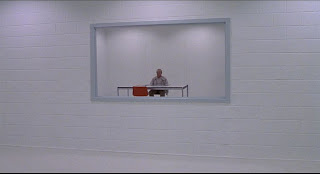
As we start we have a narrative frame of Sy in an interrogation asked why he hates Mr Torkin so much, although this is just a frame for us to expect the worst the colours are important from the very start and Sy's relation to the colours blue an white are instantly cemented.
The blue in the background matches the bag Sy usually carries and the waistcoat he works in and the general colour scheme associated with his character. Along with the white of his home, workplace and interrogation room all balanced to be tinted a little blue or completely neutral we get a feeling of sterility, it is almost like a hospital in its colouring, through this we get no emotional hints about Sy's character, he is blank and sterile himself. The colour isn't so much cold as it is bleak and the extreme use of a pure white is unsettling, the pollution of a colour generally associated with good things.

Here we come to the lighting change featured in the film, whilst the lighting doesnt change a large amount it is significant and signifies darkness, the other side of the mall and the other side of Sy.
The idea of what happens after the lights go out, what Sy does when he isnt under scrutinisation of the public is extremely important to the film which hinges on the idea that Sy wants to bring things that he figures out in the shadows to the light of the mall.

This is accompanied by a momentary change in white balance from white to a more neutral yellow:
At this point Sy is living out a fantasy in which he is a member of the Yorkin family, looking at their photos he tells the waitress they are his family. The yellow balance both symbolises fantasy and works as a bridge between the sterile life of Sy and the vibrant warm colours used in the Yorkin home and photographs. This colour awareness is clear, in the film Sy himself sees it as his job to make the Yorkin home warm and beautiful, when the colour goes .3(minimal) blue he prematurely gets a technician out who refuses to fix it. This is one of the angriest we see Sy, it is clear that getting into and preserving the warmth of the Yorkin home is his wish, this colour balance is half way there as Sy fantasises and lies as though he is already completely there.

The difference in colour balance is most noticable in this scene, Sy's white home is intercut with the Yorkins, his home is silent and lonely, white, silver and transparent. It is blindingly pbvious when intercut with the Yorkins warm, populated, vibrant and happy household.
This colour balance is again compromised as the camera pans from the beige nothingness of Sy in his chair to the wall full of Yorkin family photos, as the camera gets closer the wall literally gets brighter and warmer showing that the photographs and the Yorkin family are where Sy steals warmth and builds emotional connections.
Sy's second fantasy involves him imagining he actually walks around and lives in the Yorkin house, whilst the colour scheme isnt as warm he actually alters his clothing, wearing a blue jumper signifying strength and comfort instead of the beige nothingness of his cardigan.
The next significant image is interesting, it involves a lot of green and is one of the few images in the film that does. It seems somewhat honest, pure and innocent maybe because it is between Sy and Jake, the scene represents the innocent and kind side of Sy which is usually hidden by loneliness or social structures. This is possibly the last time in the film that things could go well, however Sy oversteps his mark and Jake wont take a toy from him. This realisation and the discovery of Will Yorkin cheating on his wife present one of the turning points of the film in which Sy decides to bring to light from the "dark" information in the form of photos.
This red scene is actually the first time we actually see a full character in the "dark room" at the photography booth, the colour red symbolises rage and anger, Will has everything Sy wants but is throwing it away and the rage inside Sy needs to come out.

A long tracking shot follows Sy's decision to stir things up, the photos were not enough so he has to take further action, after being fired a long tracking shot keeps Sy in perspective as he walks through the store, the shelves envelope and tower over him. As the music swells he takes a knife from a cabinet and stuffs it into his bag. The long tracking take forces the viewer into Sy's mind, we are towered over and pulled in sympathising with his decision despite its insanity.

Sy's inner conflict swells, after falling asleep during The Day The Earth Stood Still the dialogue "Your choice is simple, join us and live in peace or pursue your present course and face obliteration". This represents Sy's decision to commit social suicide and commit himself to the white nothingness of his dreams to "wake up" Will Yorkin and show him the same choice. The white and red in his dream clearly signify Sy's realisation that he will never be in the Yorkin family, that dream is now dead.
He wakes from his nightmare he has a shower, a classic sign of a characters change in perspective in films, and it is clear that the colour pallet has changed from a white blue to a calmer softer white signifying Sy's acceptance.
We even see Sy's wall again, this time however the room is neutral and the cold daylight shines on the dead wall.
I am surprisingly going to ignore the climax of the film, apart from a small section in which Sy runs away through a room of red, then blue, then red again mimicing police lights and signifying his imminent capture the colour pallet is the same beige nothingness from the rest of the film. That nothingness is what Sy is pushing Will away from and sacrificing his own warmth in exchange for the cold white of the police interrogation room.
The only spurt of colour in the room is the red chair, it is the exact same colour as Jake's jumper and represents Sy's empty memories of the Yorkin family however there is still some hope in his mind that he is still in some way "Uncle Sy".
This fantastic slow fade shows that he knows what he has lost, and understands that his body is trapped, but he might have kept the Yorkin family together and for that he allows himself a little bit of warmth.
It is clearly shown throughout the whole film and through these images themselves that white balance, colour schemes and warmth are extremely important to the narrative of the film. In a reflective way Sy himself is meticulous about the colour of his prints, this film proves his point that colour is one of the keys to emotion and the films use of colour keeps that in mind, manipulating and unlocking our emotions at perfect points.


Filmography
1. One Hour Photo (2002), Romanek M., USA ,Fox Searchlight Pictures
2. The day the Earth Stood Still (1951) Wise R., USA, Twentieth Century Fox Film Corporation 

Tuesday, 26 February 2013

Pitching the 10 min and discussing the 2 min Drama


More drama updates for all you folks!

For the whole project we need to produce two films, today we discussed the 2 min film in depth with our tutor as well as discussing the whole 10min with the group. This was really helpful, we got a lot of good feedback about the work and some new directions to go in including making it a family movie and mixing in my idea about repressed anger. It definitely made the film more attractive to me, I still need to read the script but once we get the 2 min out of the way I will start working really hard on that itself.

Till then its all about the 2 minute, we got a lot of good feedback about that too, especially in the form of revenge thrillers. Specifically "Dead Man's Shoes" (2004 Shane Meadows), the world Richard is in, and the murders he commits are given context and his anti hero character hinges on the evil of those around him. One of the conflicts with our project and this film is that our "anti hero" doesn't have a really big reason to commit the awful act of violence, we need to walk a fine line of not making him too hatable and getting the audience towards empathising.

We met after the class and discussed a few things, first off we finalised our locations, my house works really well for the scene of Dean and Jenny. This is simply because when I wrote it in I thought about my living room and kitchen so with Christi's set dressing they should look good. Secondly we are going to use Christi's house for the second location and bathroom, his room is big enough and he thinks he can dress it to look like a clean bachelors apartment.

So its all going well, unfortunately I still dont have all of the actors but they are on the way, we have Tom cast but we need Dean and Jenny. I'm going to get Nathan to help me find two other actors asap!

Sunday, 24 February 2013

Defiance and Castle

Its been a long week full of work and catching up. No filming done but lots of planning reading and writing. I haven't watched all that much for uni, its been more of a theoretical and practical week rather than reviewing. That being said the one film I did fully watch is exceptional, 24 Hour Photo, a heavy theoretical review of that is on the way. Television has been fantastic this week, for Castle! The best episode to date I think, I love Cap'n Mal but after the last episode Fillion has shown his best performance to date in this weeks Castle, it was stunning.

I watched Cougar town, New Girl, 2 Broke Girls, Sparticus and Arrow but the only particularly special thing to note is that Jamie Bamber ie. BSG's Baltar was a wicked villain in Arrow. The rest of my week has been taken up by watching and rewatching videos for the upcomming Xbox MMO and Syfy TV series Defiance. Words cannot describe how much I am looking forward to it.

Aside from theoretical papers and comics I have been reading Halo the Fall of Reach, I am really enjoting it, its making me more and more of a fan of Chief, who I never really cared for. My only problem with it is that I love the Reach game and I can in no way see it lining up but oh well.

Finally on the internet this week I got tweeted by Bear Mccreary, Defiance and Joe Keatinge (the writer of Morbius), out of these Mr Mccreary really made my day, genius!

If you want to know what comics I read check out this weeks CBT, thats me for the week, time to get on with more Shtako. Over and out!

Saturday, 23 February 2013

More scripting and shot listing


More info on the upcoming "Short story in brutality"

After scripting out Jordans idea and talking it through, taking it all the way to a basic practice shoot we were all fairly confident about the project so we met up on monday to discuss where to go from here. Unfortunately Joe wasn't there and because of her difficulty getting about at the moment Amy couldn't attend either but we still got a lot of work done!

Firstly we had to look at amending the schedule, I wanted to shoot this weekend but it turns out thats not going to be possible because of a lack of actors. I posted on the ShuDrama facebook about a casting session but nobody got back to me. Since then however I have found one of our three actors, he could be either part, I have worked with him before and trust his skills as an actor. 

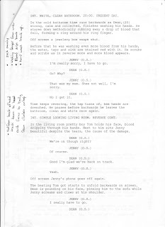
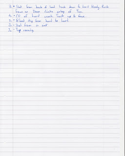
The monday session was really helpful and as a producer I think I really got a handle on the more creative part of my role. Whilst I get that Jordan has the majority of the creative control I really wanted to nail down shot for shot what the film will be, in doing so a lot of "kind ofs" and "a bit like"s were thrown out and I flt as though it was my job to settle creative disputes and change kind of's to exactly what they would be. I notated on the script and this is what it ended up like:
With my own script slightly adapted and the scenes divided literally into single shots I wrote a shotlist to be storyboarded. 

That is it or now, the search for actors, prop gathering and planning a pitch for the lesson should keep us busy, even though we are behind schedule I am not worried. 

Friday, 22 February 2013

Defiance SOON

DEFIANCE SOON!!

Backwards editing and practice shoot


This is what happened after our practice shoot for my upcoming drama project "A short Story in Brutality"

We did the practice shoot yesterday, we didn't get a lot done, it ended up being a little bit of experimenting and a little bit of a reccie as we didn't have a woman to act and Christie and Joe couldn't come.

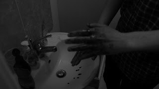
As it is only a practice shoot I thought I might as well edit it myself and document what I do to help Amy out when she is editing. First I learned how to turn images black and white and reverse them. This is reletively simple with the speed control (right click the clip) and with the image control effects. I then looked at two similar shots from the day to compare their quality, one was taken in black and white (left) with the monochrome setting on the camera and the other was grey scaled in post (right).
To me it seems like the converted greyscale is better quality however I have another example.

In this shot I actually preferred the clip taken in b/w however after altering the contrast on the other clip it looked better. It is however not as good a take in general even if the film is to be converted to b/w in post for this exercise I am going to use the clip taken in monochrome. On the bright side the blood is really easy to see which is excellent! The shot comes across really nicely, when we consider the framing a little more and set the shot up a little better with lighting im sure it will be brilliant.

Another thing I learned or had confirmed in the edit is that the two "stalking" shots we had took up a lot of time, although they are not final and would be tighter we planned on having a few other too, at the moment they already take up a minute!

Finally I discovered that it is really confusing to edit a scene backwards, especially the fight scene which relies on continuity. I suggest when we edit the final project and rushes that we edit them forwards first and then reverse the whole film at once, reversing parts on separate time lines to review it as the process goes on. This is simply because of how confusing it is to backwards edit something.

I have a lot of images from the day too, I will upload and talk about the day in general soon.
Here is the final experiment/ practice.

Whilst it is a little dodgy you can clearly see a lot of the scenes, stalking, the fight and washing the hands. The fact that they all work backwards has given me the confidence to go ahead with the full film and the shot by shot planning will be done soon.

Thursday, 21 February 2013

CBT! Morbius 2, Indestructible Hulk 4, Nova 1, Avengers 6.

Morbius #2
The second issue of Morbius finally came out and whilst it spent a bit of time filling in gaps in the last issue it was pretty decent. The art was almost exactly the same, moody but not depressing, pathetic or a derogative of Miller, hurrah! In fact if anything it is reminiscent of Ron Wagners art in the 1992 series Morbius the Living Vampire. The whole series feels as though it is set in the same kind of slums (I know its not) with the same kind of villains, which is good, it works! It is nice to see Morbius not scrabbling for a cure for a change though and it would be nice to see that dynamic continue. I think this series has great potential, at the moment it seems to be concentrating on good simple stories which I like, it would be cool to see his own universe expand a little though. For an old 90's horror comic fan it would be nice to see midnight sons is all im saying, GR has been cancelled after all.... Anyway another decent issue of Morbius, next one should pick it up another notch!
8.5/10

Indestructible Hulk #4
This issue of Hulk teased us more and more with the current life Banner is living, we get less answers but more of an idea of who Banner is each issue. The comedy of the comic is one of its strongest points and really stands out in this issue. On the down by the nature of the comic it has to be very split, straight down the middle, story then action, in every issue. Hopefully there will be more of a way to mix it up in the future but its not stale just yet. Overall the issue was another good one, I love the internal monologue although it all felt too short, I want more pages of this book!
8/10

Nova #1
Well I don't like the cover, and after flicking through it looked poor... I was happy to be proven wrong. The one thing I didn't expect to find from Nova was an emotional family story, whilst I hope it doesn't become teen drama, it is nice to see a comic that has a bit of family drama. This mixed with the slightly confusing back plot that, I'm sure will be explained, delivers the right amount of action and story with uplifting endings. I have no idea about the space stuff in Marvel but looking forward to discovering it in A lot of new space books that this seems to be a part of. It smells of a Guardians of the Galaxy intro and tie in comic but there's nothing wrong with that.... as an xfan though I miss the Starjammers myself... Art wise it was a lot better than I expected although the art wasn't given a massive chance to showcase itself but McGuinness art should look real pretty in the space scenes.

Its good, emotional and fun but we learn practically nothing about how the series will develop, guess we will have to buy the next issue... I see you being sneaky Marvel.
7/10

Avengers #6
I missed #5, stopped buying them at #4 and am regretting it now that I have read #6. For a start any troubles I had with Kubert's art in #4 make me look like a fool in this issue. His sharp pencils and rough shading brilliantly fit the tone of the comic, they are stunning, the panneling stays basic but subtle changes add emotion (the car) that tugs the heart strings. Now to the story, like I said I missed #5 but I don't seem to have missed much, this seems a lot like the origin issue for Hyperion just more emotional and better told. The other brilliant thing about this issue is that Hickman writes SpiderOck in this better than Dan Slott does in Superior, his bitching and general demeanour were brilliant throughout. SPOILER I really hope Hickman changes his tune away from creation, both universe creation, mini world orb creation (XF), or Alien terraforming because I feel like its a little old, still epic but getting a bit worn. END OF SPOILER

It was a light emotional read exploring some of the unknowns of the new team. The stunning art work goes a long way to making this comic as good as it is, with no action it still felt fluid and entertaining. Still not sure if the series is a keeper though, it doesn't seem to have found its feet yet, maybe thats the point though, too many cooks? I dunno, decide for yourselves its worth a few quid!
7.5/10

Wednesday, 20 February 2013

Drama! Reccie+Practice

We did a little reccie and practice shoot for our drama a little while ago, this is how it went, we took lots of photos on a sexy 60D!


 This first image is a quite high ISO but is a basic shot of the tunnel we want to shoot in.


 The next few are a little darker, thats the kind of ISO we want to shoot at so we will definitely need lights. However the location is really nice, we definitely want to use it.


 This is a few shots from a roof of a car park, it overlooks "Won Ting" a restaurant that we plan for Tom and Jenny to meet.


This is the second tunnel we looked at, it wasn't quite as dramatically lit so we are going to use the other one.


 This final reccie was of another potential stalking location however it might be a little to rural for the scene.


 The house we used for the location wasn't ideal but did work. The window let a lot of light in but for shooting we would have them closed, more lighting would be needed. The bed was well located and the wall just by it worked well for Jenny being thrown. The room was a little small though, we didnt have a lot of room to fight in.


This bathroom was cramped and the tap was wrong but light was strong enough and we got the practice and shots we needed to test.

Finally we tested a liquid latex solution that looked really cool. With blood effects on top  I think it will add realism and make the bathroom scene look really special.